Retrato :: Portrait

O trabalho da Ashley Goldberg (aka AshleyG) é já conhecido por muitas e muitas pessoas — ela é, efectivamente, uma espécie de rockstar do Etsy. Há uns tempos a Ashley começou a fazer retratos por encomenda e, visto que os 35 anos do Tiago se aproximavam (foram ontem!), resolvi encomendar um retrato nosso. Depois de alguns e-mails e muitos envios de fotografias, eis o resultado final:
The work of Ashley Goldberg (aka AshleyG) is already known by lots and lots of people — in fact, she is kind of an Etsy rockstar. Some time ago Ashley started making custom portraits; since Tiago’s 35th birthday was coming (it was yesterday!) I commissioned a portrait of the two of us. After exchanging some emails and sending many photos, here’s the final result:

O Tiago adorou o presente e eu não poderia estar mais contente com o nosso retrato! Podem ver o trabalho da Ashley na sua loja, acompanhar o seu flickr e ainda ler sobre o seu dia-a-dia no seu blog.
Tiago loved his birthday present and I couldn’t be happier with our portrait! You can check out Ashley’s work in her Etsy shop, visit her flickr page and read about her everyday life on her blog.

Dress to Impress :: Swimwear

O post de hoje não é propriamente sobre vestidos, mas antes sobre fatos de banho que parecem mini-vestidos. Com o calor que rebentou em Lisboa só apetece passar o dia na praia, por isso deixo-vos com inspiração retro para começarem o fim-de-semana em grande. Divirtam-se e apanhem sol se puderem!
Today’s post is not really about dresses but rather about bathing suits that resemble mini dresses. The weather in Lisbon has suddenly turned so hot that all I can think of is spending the day at the beach — I’m leaving you with some retro inspiration to start the weekend in the best possible way. Have fun and catch some sun if you can!

1940
1946
1950’s
1954
1954
1954
1954
1954
1956
1957
1959
1959
1960’s
(images: My Vintage Vogue)

Stylish Stylist :: Paul Lowe

Na minha estimulante busca de imagens de styling, tenho-me deparado com fotografias demasiado boas para não serem mostradas aqui. Pensei então inaugurar uma nova rubrica intitulada ‘Stylish Stylist’, na qual partilharei convosco o trabalho dos meus stylists de eleição.
Começamos hoje com um senhor extremamente talentoso que é simultaneamente prop stylist e food stylist, o que significa que não só é ele quem selecciona os adereços e faz o mise en scène, como também prepara ele próprio a comida apresentada. É norueguês e dá pelo nome de Paul Lowe, mas na blogosfera é mais conhecido por Sweet Paul. Foi muito difícil seleccionar apenas uma dúzia de imagens do seu trabalho, por isso é obrigatório visitar o blog do Paul para ver mais. Prometo que não se arrependerão!
In my stimulating search for  images of styling I have come across pictures that are too good not to be shown over here. Such profusion of excellent work has made me want to start a column called ‘Stylish Stylist’, in which I’ll share with you the work of my favourite stylists. 

We’ll start today with a very talented man who is simultaneously prop and food stylist, which means that not only does he select props and does the ‘mise en scène’, he also cooks the food that’s being presented. He is Norwegian and is called Paul Lowe, but in the blog world he’s known as Sweet Paul. It’s been extremely difficult to select only a dozen pictures of his work so you really must visit Paul’s blog to see more. I promise you won’t regret it!


(images: Paul Lowe)

Dress to Impress :: White

Porque os vestidos brancos não são um exclusivo das noivas. Porque os vestidos brancos ficam bem no Verão. Porque os vestidos brancos são etéreos. Hoje é dia de vestidos brancos!
Because white dresses aren’t just for brides. Because white dresses are ideal to wear in the Summer. Because white dresses are ethereal. Today is white dresses day!
1920’s
1941

1950’s

1951
1952

1954

1956
1959

1960
1962

1965
(images: My Vintage Vogue)

Fabulous Fabrics :: Anna Griffin

Tenho reparado que os tecidos que vou comprando apresentam alguns elementos em comum. Alguns deles são, naturalmente, as cores: na hora de encher o carrinho de compras virtual, inclino-me quase sempre para os azuis e para os encarnados. Mas mais do que isso: apercebi-me de que muitos dos meus tecidos foram desenhados pela Anna Griffin. Menos mediática do que algumas das suas companheiras de profissão, aquilo que mais me agrada nas suas criações é a reinterpretação de padrões clássicos, através do recurso a cores vibrantes e a linhas muito definidas. Eis alguns exemplos do seu trabalho:
I’ve been noticing that most fabrics I buy have certain elements in common. Some of those elements are colours: when it comes to adding items to the e-shopping cart, I usually choose blues and reds. But there’s more to it: I realised that many fabrics I own have been designed by Anna Griffin. Anna is less mediatic than some of her colleagues and what I like the most about her creations is the reinterpretation of classic patterns through bold colours and very sharp lines. Here are some examples of her work:


Mid-century modern inspiration

Passear de blog em blog em busca de inspiração é óptimo, mas por vezes o que apetece mesmo é pegar numa revista e ir tomar um café à esplanada da esquina. Há qualquer coisa de hipnotizante no folhear das páginas e na evasão que isso proporciona. Uma das revistas de que mais gosto é a Country Living (versão britânica): a qualidade é constante, o styling perfeito e desenganem-se aqueles que acham que a revista versa apenas sobre cavalos e rosas inglesas!
Strolling from blog to blog in search of inspiration is great, but sometimes you just feel like grabbing a magazine and going out for a cup of coffee at the terrace around the corner. There’s something almost enchanting as you flip through the pages and feel transported to some sort of magical world. One of my favourite magazines is Country Living (British version): constant quality, perfect styling and don’t you think it’s only about horses and English roses!

A reportagem que mostro hoje apareceu na edição de Setembro de 2008 e versa sobre a estética dos anos 50 e 60. Quando vi estas páginas pela primeira vez, delirei com o tema, com a escolha das cores e com a coerência das diferentes fotografias. Ontem, ao folhear um dos meus dossiers de inspiração, voltei a deparar-me com elas e resolvi partilhá-las convosco.
The piece I’m showing today appeared in the September 2008 issue and features 1950’s-1960’s aesthectics. When I first saw these pages I really loved the overall theme, the choice of colours and the coherence of all the pictures. Yesterday, while going through one of my deco files, I stumbled upon them again and thought it would be nice to share them with you.

Até há pouco tempo achava que o azul-escuro era uma cor aborrecida, até ao dia em que experimentei conjugá-lo com verde lima e passei a olhá-lo de outra forma. Estou a gostar muito de o ver aqui, ao lado de amarelo, de azuis mais abertos e até de cinzento.
I used to think that navy blue was a dull colour until I tried placing it next to lime green; since that day I started looking at it in a different way. I’m loving it here next to yellow, brighter blues and even grey.

Alguns destes móveis são-me bastante familiares: vejo-os em casas de praia, em casas de avós e, claro, em blogs actuais. Viva o vintage, viva o mid-century modern!
Some of this furniture looks very familiar: I’m used to seeing it in beach houses, grandparents’ homes and, naturally, on blogs. Yay for vintage, long live mid-century modern!

A saga do armário :: The cupboard saga

Morar numa casa pequena significa uma omnipresente e quase crónica falta de espaço. Após um ano e meio a viver neste apartamento, encarámos o problema e decidimos arranjar mais um armário. Apesar de ser grande adepta do IKEA, ainda sou mais apologista de aproveitar e adaptar o que já existe. No meu antigo quarto existia um armário que tinha vindo de casa do meu avô; esse armário só tinha um problema: era escuro. E eu, que vivo numa casa pequena e que passo muitas horas a trabalhar no quarto dos fundos, gosto de móveis claros. A solução estava à vista: pintar o dito armário de branco.
Living in a small home means an omnipresent, almost chronic lack of space. After one and a half years living in this flat, we finally faced this problem and decided we needed a new cupboard. Although I am a big IKEA fan, I’m even keener on reusing and transforming what one already owns. In my old bedroom there was a cupboard that used to be in my grandfather’s home; this cupboard had a single problem: it was dark. Provided that I live in a small flat and I spend a lot of hours working in the back room, I prefer light-coloured furniture. The very obvious solution was to paint it white.


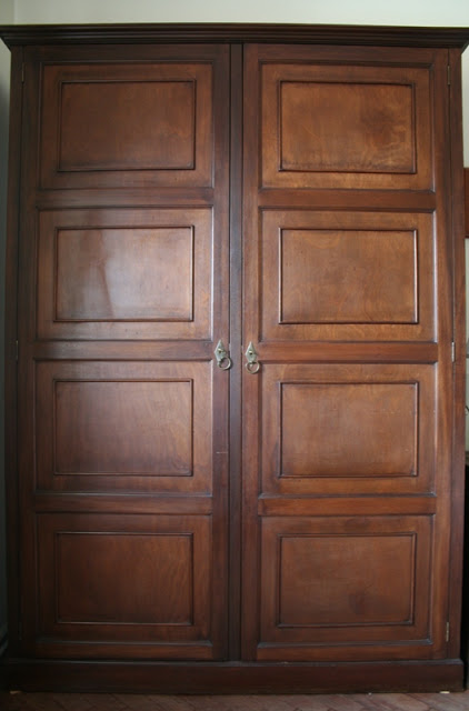
Sei que há muita gente que acha um crime pintar madeira, mas nem o Tiago nem eu nos incluímos nesse grupo. Acima de tudo, acreditamos que aquilo que nos rodeia deve ser funcional e agradável aos nossos olhos. Assim, pegámos em lixa e pincéis e enfrentámos o bicho. Depois de quatro, q-u-a-t-r-o fins-de-semana seguidos — com outras actividades de permeio, para não enlouquecermos –, o armário está finalmente no quatro de costura/escritório/casa-de-jantar. E nós respiramos de alívio.
I know there are a lot of people out there who think painting wood is a crime, but neither Tiago nor I feel that way. Above all, we believe that the objects that surrond us must be functional and pleasing to our eyes. So we got our hands on some sand paper and some brushes and we started working on it. After four, f-o-u-r weekends in a row — with some other activities in between so that we wouldn’t go mad –, the cupboard is now in the office/sewing-/dining room. And we are so relieved.

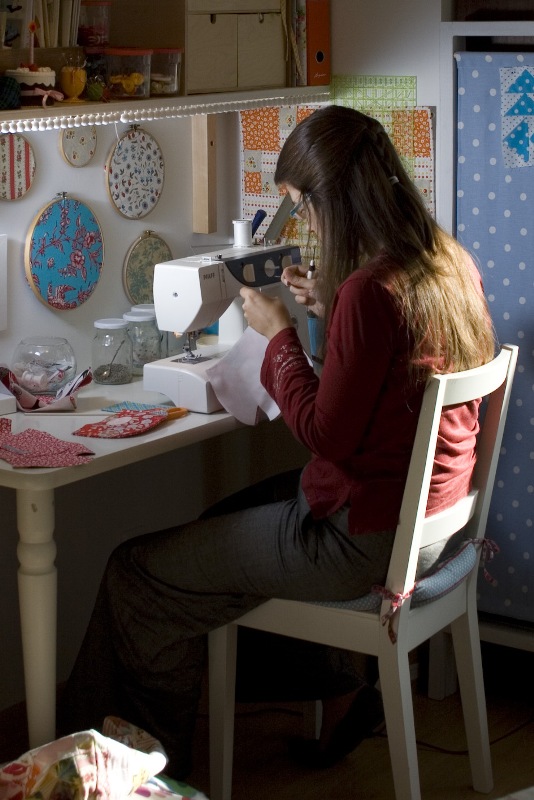
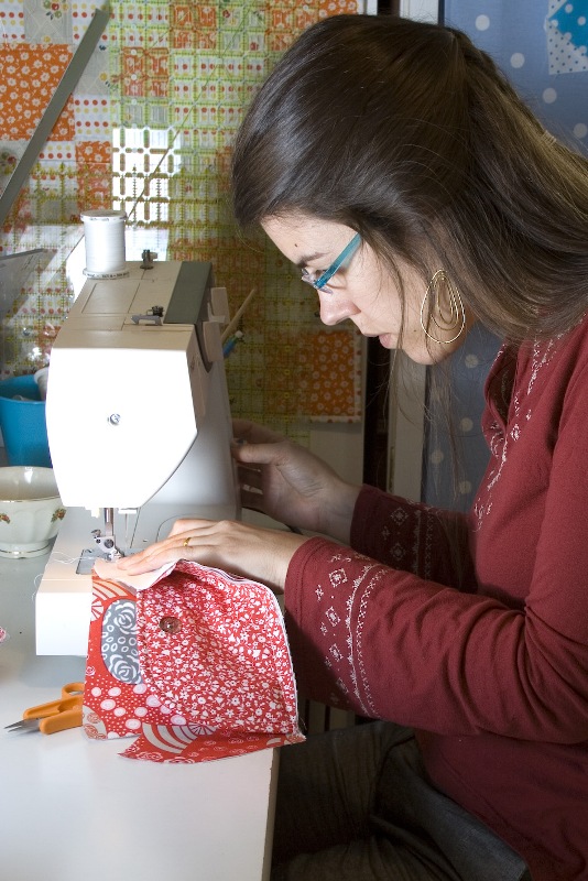
durante as pinturas… :: while we were painting
já no seu destino final :: at its final destination

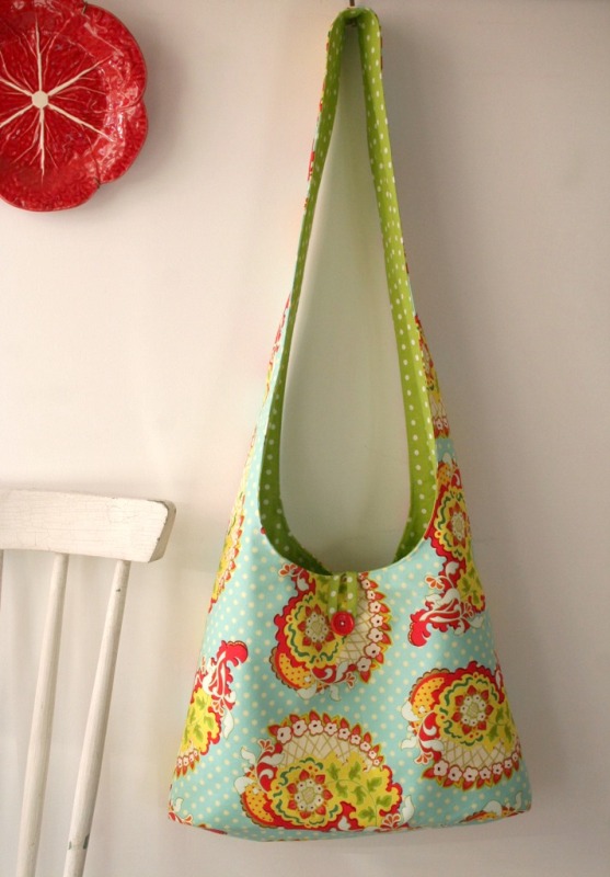
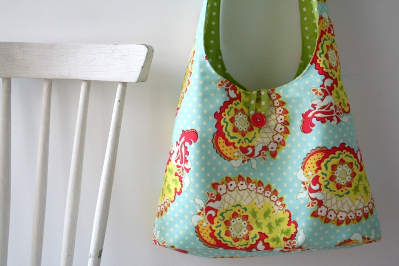
alguns dos seus novos conteúdos (esqueci-me de dizer que forrámos o interior com papel de parede) :: some of its new contents (I forgot to mention that we wallpapered the inside)

Finito!

(images: Tiago Cabral)